Q: [speaking of the three core hardbacks: Dungeon Masters Guide, Players Handbook, and Monster Manual] "Which is your favorite of each book?"
Here's my side of the ramble that followed ...
3e was odd. The abstract and stylized trade dress signaled a bold departure from the prior 26 years.
But I think it would have worked if they could have been embossed or something--had the heft and actual texture to match the pretense.
But you can see how an AD&D guy who came up on that coloring book look to the original Monster Manual would be left cold. I mean, the images by Dave Trampier were so simple yet evocative ... almost art nouveaux ... that many people *did* treat them like coloring pages.
The best Dungeon Masters Guide cover is the 1e AD&D one ... not the Sutherland original ... which is busy, stiff, awkward, and charming ...

... but the reprint with the Jeff Easley painting. The figure in green is the focus. The doors are almost like the gates of a DM's screen. He has the key around his neck and permits or forbids the exodus of the teeming, nameless horrors behind him.
The best Players Handbook is of course the classic Dave Trampier demon idol with the party mopping up dead lizardmen. Nothing fresh about that opinion and in fact I think people would come looking for me if I made any other claim.

It looks the most like the actual game feels out of every cover produced to date. Everything about it is right: the party size and composition, the conversations taking place (D&D is about talking, after all), the violence, the motives of the adventurers, the scale of the dungeon and the focus on it as a discreet and unique environment ... it's all there.
Small wonder that this one painting has received so many nods and homages in painting and other media.
Best Monster Manual ? ... that's tough ... they are all kind of misses in a way.
Do you do a menagerie?
How do you do that realistically so that it doesn't look like a dinosaur book for seven-year-olds? Or is realism even the goal?
So if a menagerie approach is out, which one or two monsters are you going to pick that stand for the entire 45 year corpus of creatures?
Red dragon?
Bit on-the-nose, but okay. But Easley's AD&D updated cover is ... odd. He's generally not great at horses (though these are better than average for him).
Frankly I think his approach to dragons is off. They have almost human skeletons in his art ... with these weight lifter necks. He struggles with a quadruped foreleg. By AD&D 2e his dragons have wrists, hands, and even opposable thumbs.
So I'll assert that the best Monster Manual cover hasn't been painted yet!
Or rather, that it was, but was used on some other product.
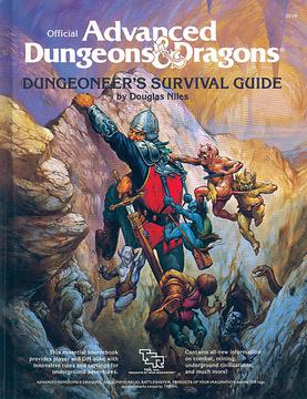
Take the Dungeoneer's Survival Guide:

It has a hapless explorer pulling himself (and his surviving chum) up out of a cleft while being swarmed by kobolds, a snake, and even a spider for good measure. It's much more reflective of actual play than, for example, Easley's AD&D 1e Players Handbook.
I think it's important that the monsters are getting the upper hand!
Anyway, that's my take:
Best single cover = Trampier's 1e AD&D Player's Handbook.
Best trio of covers include two by Jeff Easley.
Sadly, the three together are pretty incongruous, but I guess you can't have it all :)

